
UX-UI Design
Vodafone Business Support
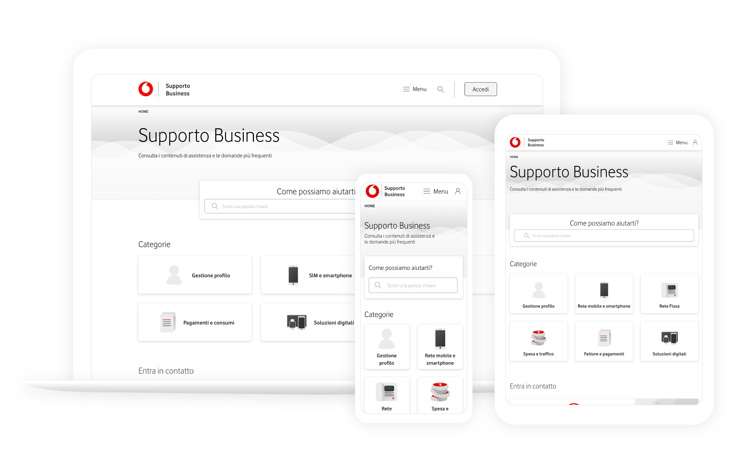
Brief
Re-design Vodafone Business Support to decrease the rebound on the call center and optimize SEO.
The main KPIs are:
- TNPS
- Customer Effort Score
- Rebound
- Organic traffic
Team
- Camilla – Service Designer
- Manuel – Service Designer
- Irina – UX Researcher
- Chiara – UX Researcher
- Valentina – Art director
- Christian – UX Designer
- Stefano – UI Designer
- Daniele – SEO Lead
- Simone – Design Lead 👈
Process
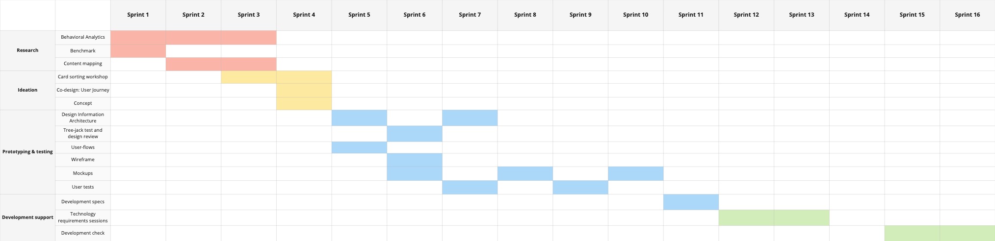
We used the Triple Diamond flow (Research, Ideation, Prototyping&Testing) together with a Participatory Design approach that included designers, developers, and project managers from the beginning.
Research
Behavioral Analytics, Benchmark, Content Mapping
Ideation
Card Sorting Workshop, Co-design session: User Journey, Concept
Prototyping
IA Design, User flows, Wireframes, Mockups, Tests
Devs Support
Development specs, Requirements sessions, Development check
Design strategy
According to the team, the resources, and the constraints I made a plan for about 16 “one-week” Sprints.
Design Kickoff
01. Research
Behavioral analytics
We analyzed the users’ behavior on the actual Vodafone Business Support. We looked at HotJar heatmaps and video recordings, and Adobe Analytics dashboards.
We pointed out these areas to be improved by our re-design:
- confusing navigation on the header
- support categories were not clear at all
- users were not able to find support content from the Google SERP
- the links inside the pages were no longer available or useful
- most of the users were used to drop and call for support (high rebound)
Benchmark
We did a benchmark to define the UX strategy of the new support site, to point out best practices and interactions.
Position Mapping
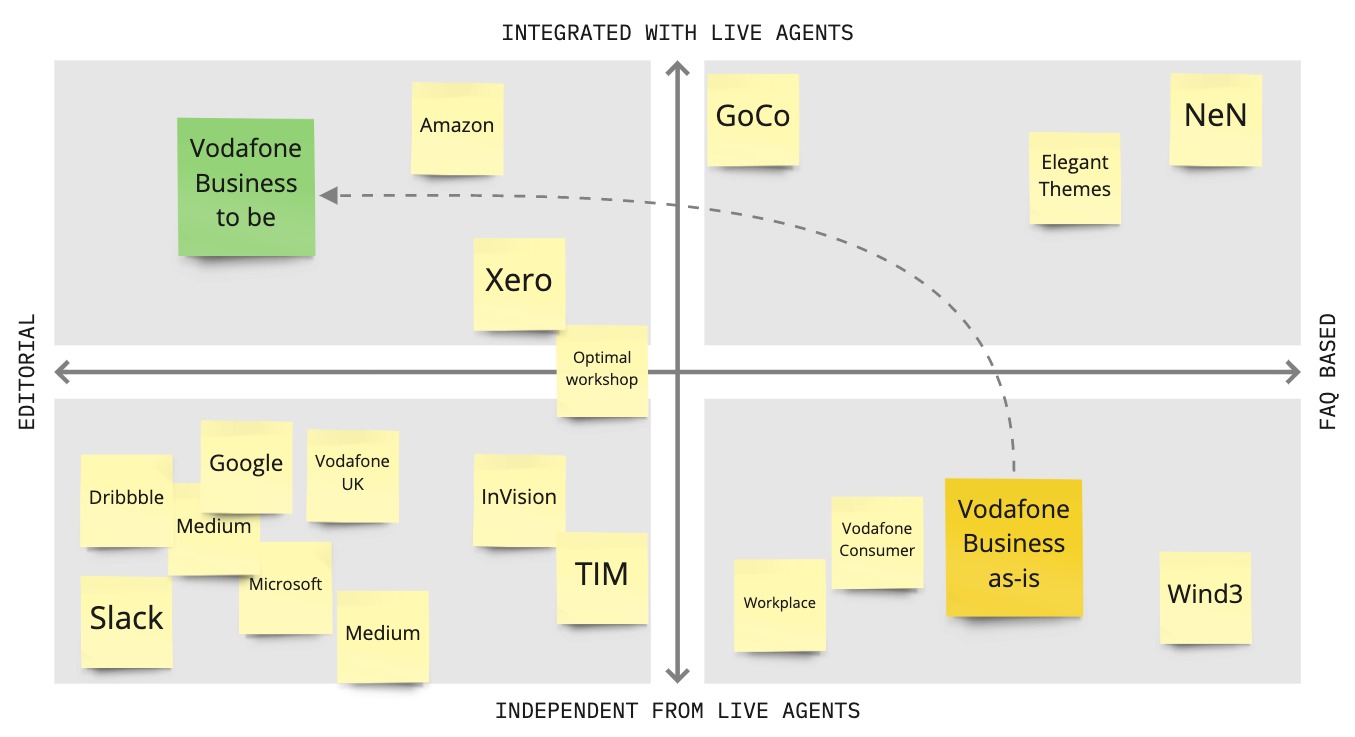
We agreed with the product team to map competitors and comparables around these two axes:
- FAQ/editorial approach;
- The layer of integration with live agents (could it be the call center or the live chat)
We agreed to change the current approach (FAQ based/independent from live agents) and place our product as editorial and integrated with live agents.
Content Mapping
We used Miro to map all the contents and the current Information Architecture. We noticed lots of duplicated, obsolete, and unuseful ones. This convinced the team to go through a complete redesign of the interface and the contents.
02. Ideation
Card Sorting Workshop
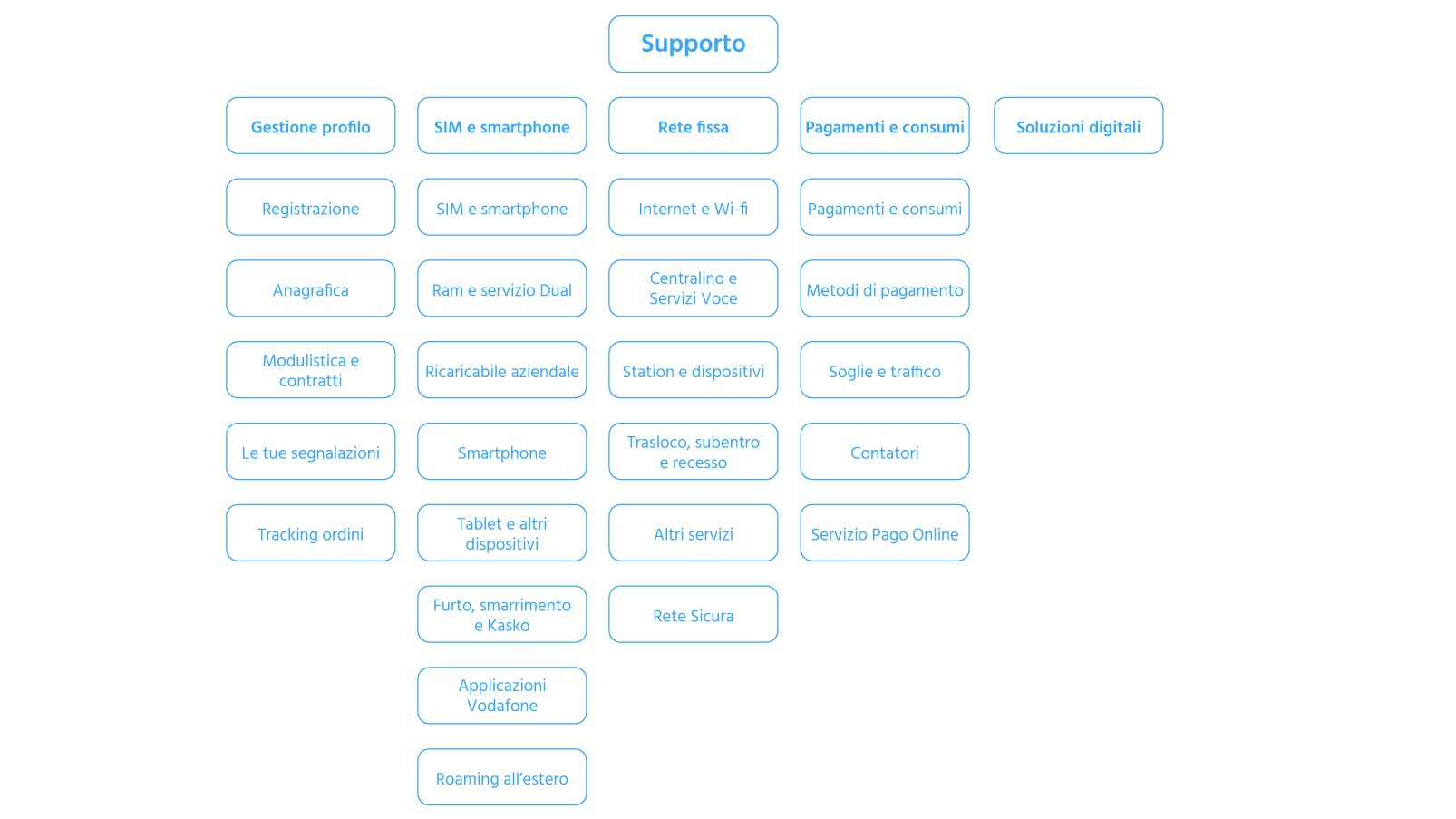
We had a Card Sorting Workshop with the Product Team to define the new Information Architecture.
We had two outputs that we tested during the Prototype & Testing Phase.
Co-design session: User Journey
We engaged the UX Research Team to help us in defining the User Journey. We associated emotional feedbacks and insights to each step. We identified these main steps:

1. User faces the problem
“Why does this always happens when I’m late!”

2. User looks for support
“Let’s check on Google or let me ask to TOBi”

3. User explains the issue
“It’s hard to explain. It’s so technical and I don’t know…”

4. Issue identification
“Don’t make me repeat it again, okay?”

5. User starts the tutorial
“It seems too long, and I have no time!”

6. User fixes the issue itself
“I’m sooo into technologic stuff!”
Problem reframing
These steps of collaboration, helped us to focus better on the problem that we had to solve. So we reframed it this way:
Concept
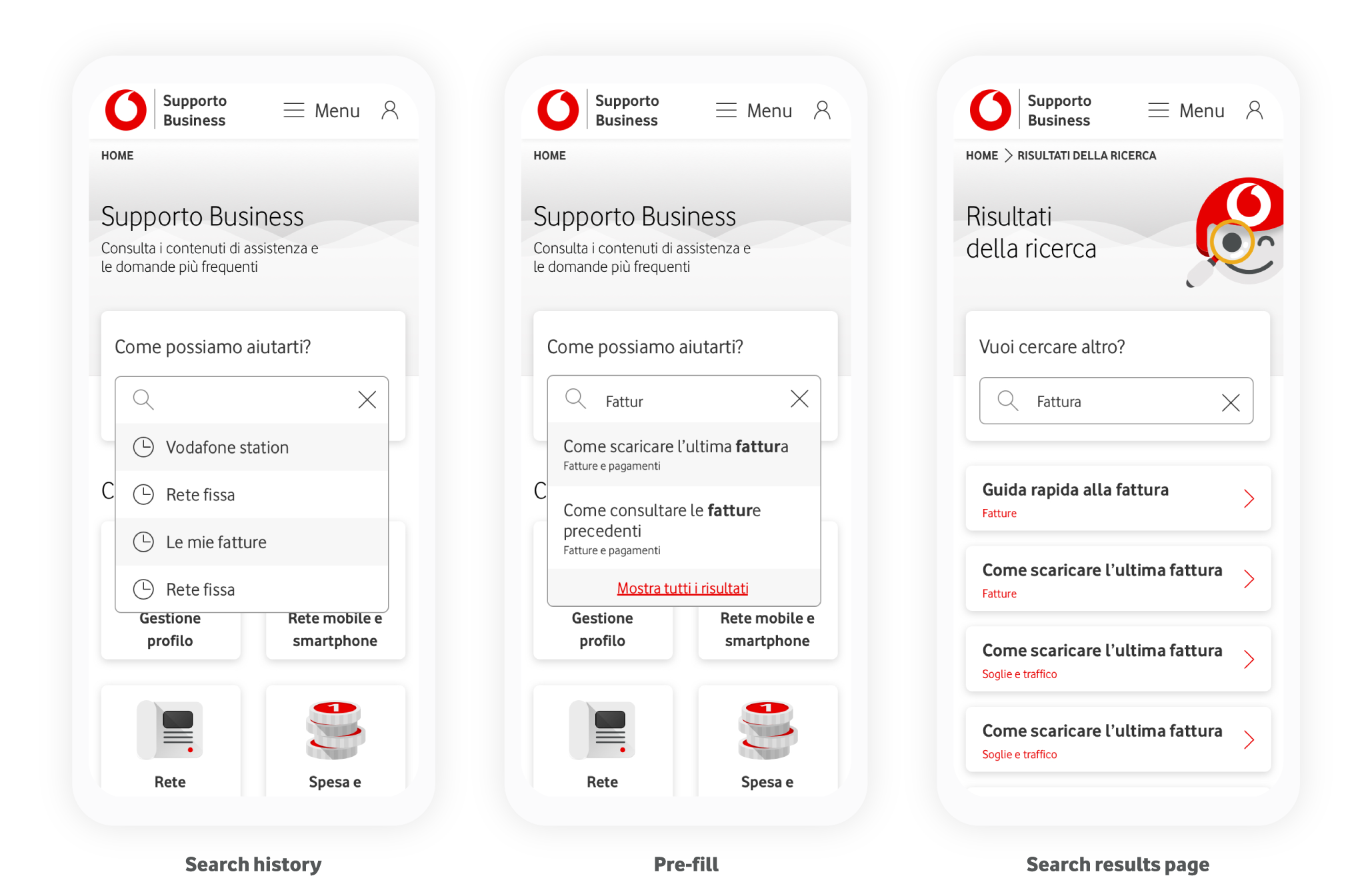
The new Vodafone Business Support will help users to find the solution to their problem, not just the information. TOBi (the Vodafone Digital Assistant) will support this process thanks to both graphic and conversational experience. The search function will be the core of our interaction.
03. Prototyping & testing
Information Architecture
We designed the IA considering the output of the workshop. We had two rounds of Tree-Jack Testing before obtaining the final version:
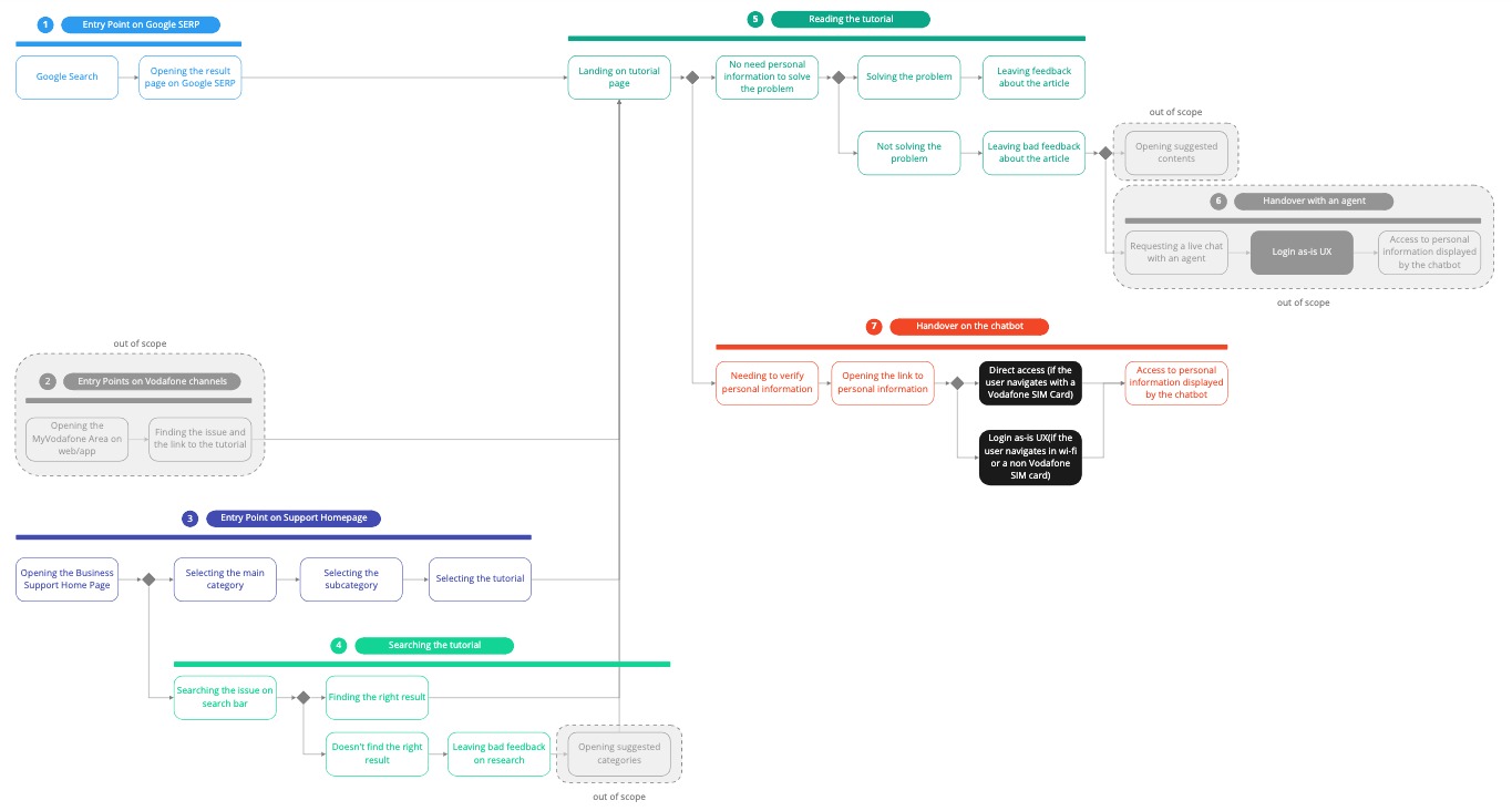
User Flows
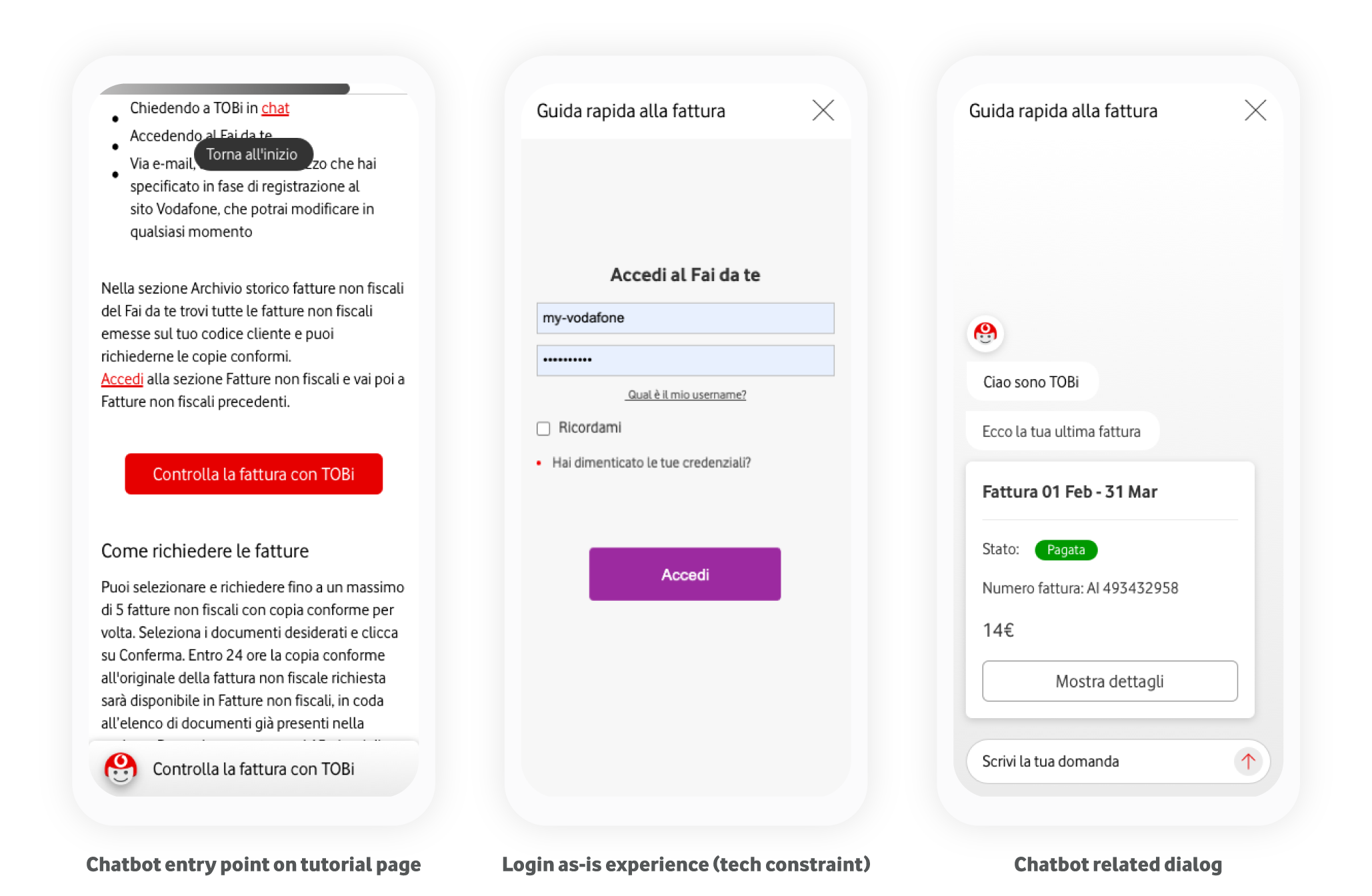
We designed user flows to deep-dive the navigation and refine the authentication process to adapt it to our project. The login as-is UX was out of scope for this project, so we needed to integrate the as-is UX with our new one.
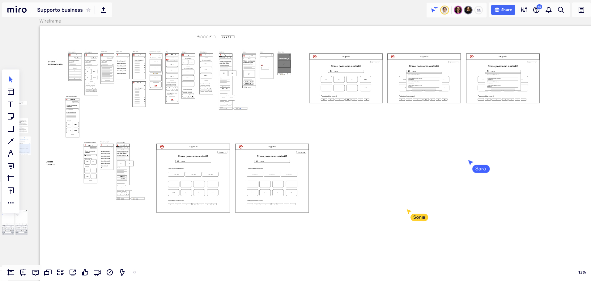
Co-design Session: Wireframe
We had a Co-design session on Miro with UX and UI Designers from Design Studio, which helped us to include in the Design different points of view and insights for each phase indicated on the user flow.
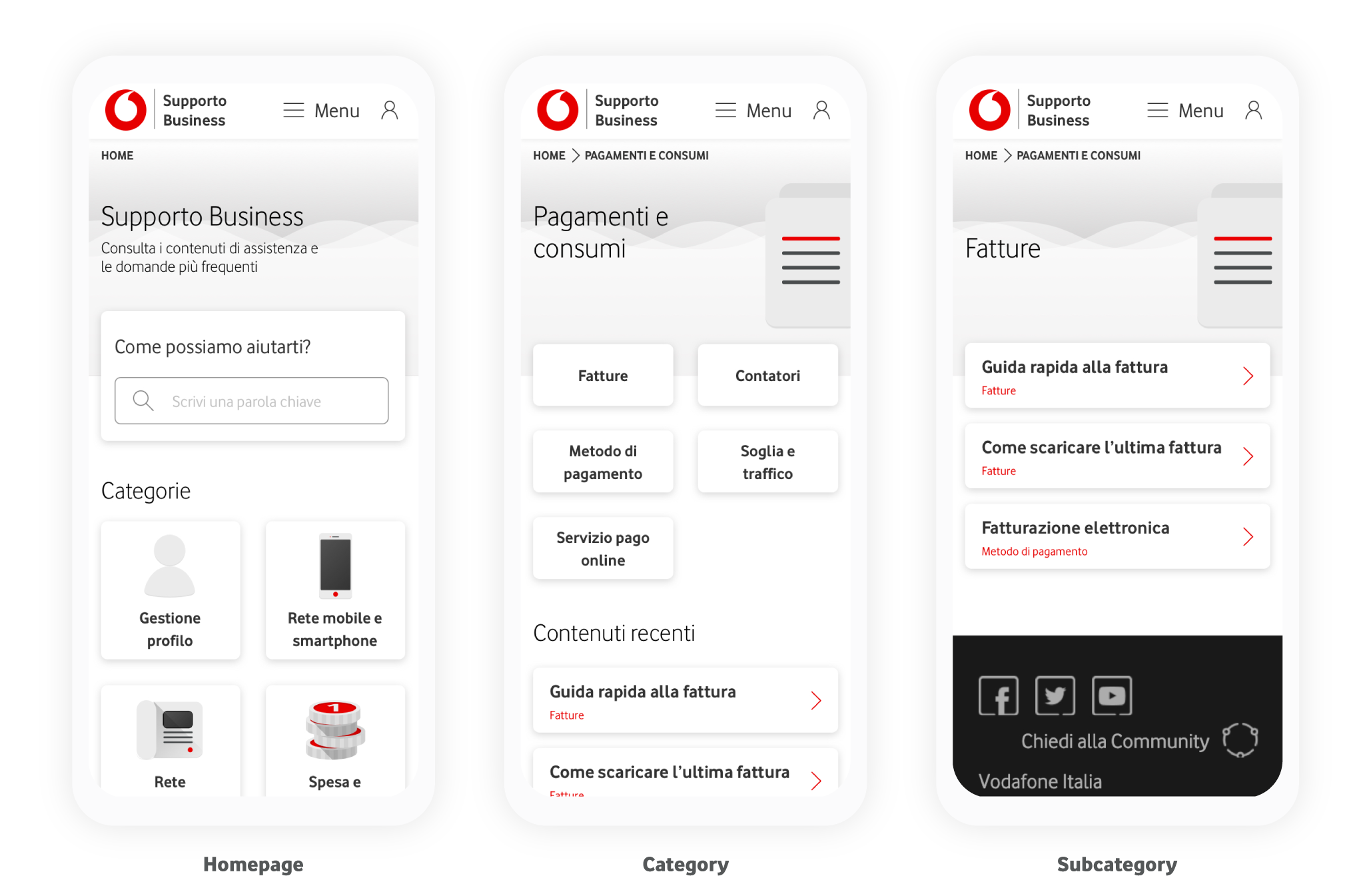
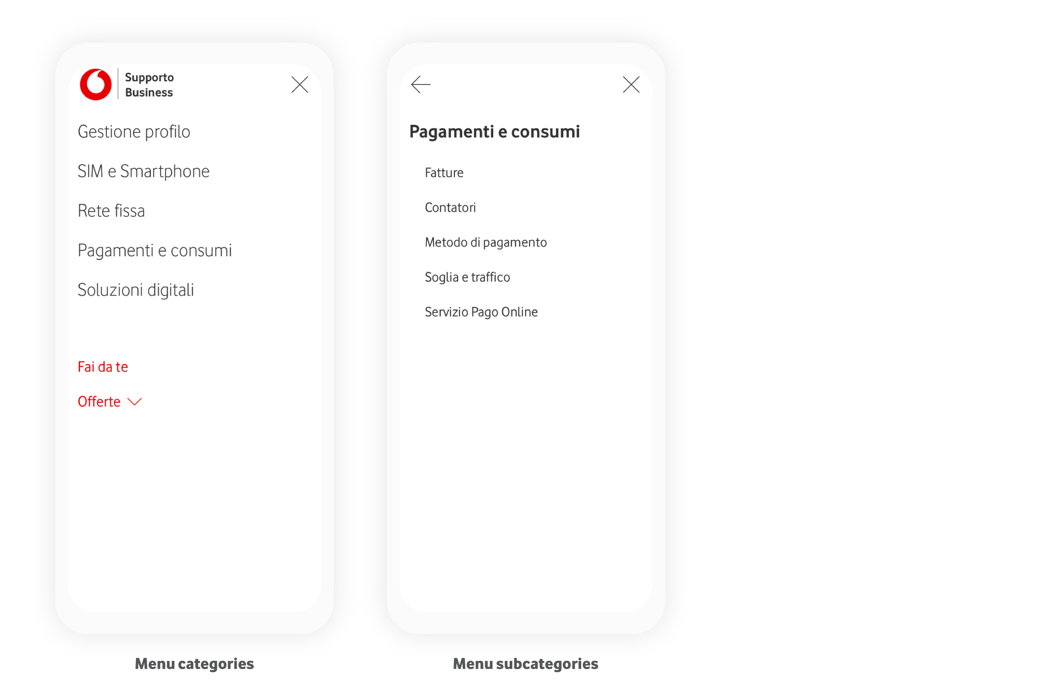
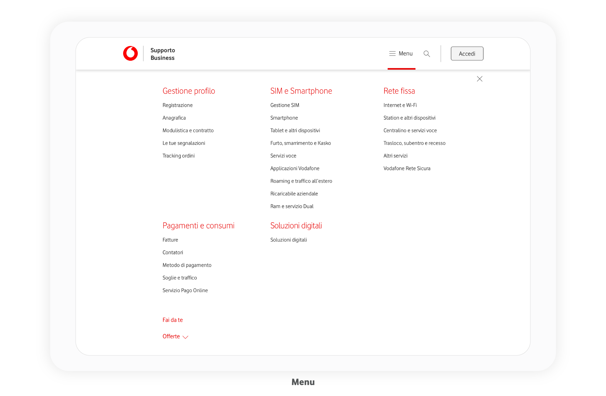
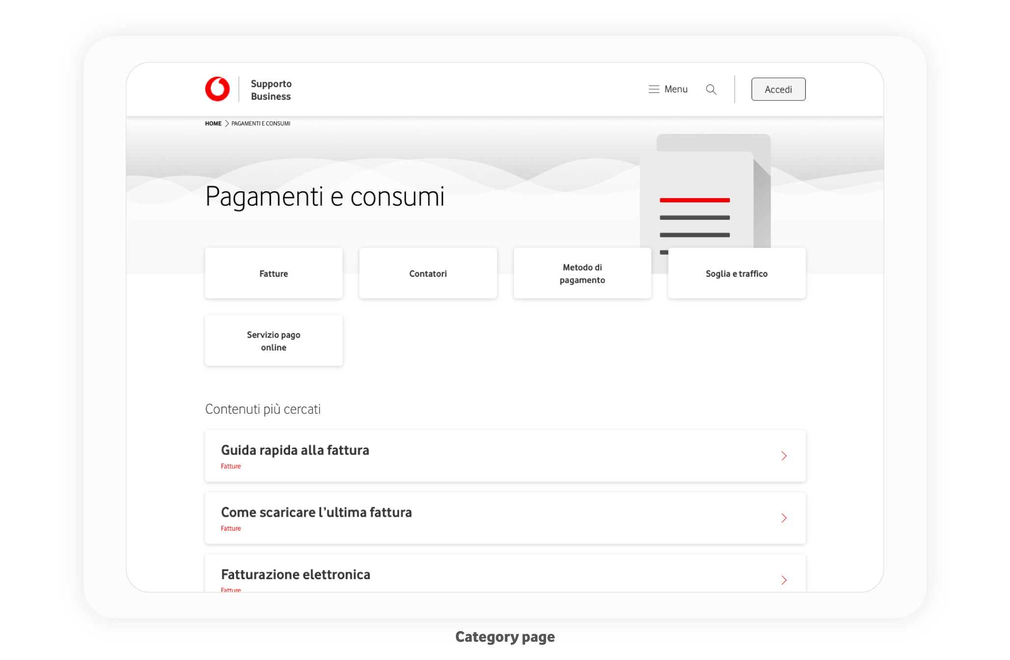
Mockups
Our design is responsive and mobile-first.
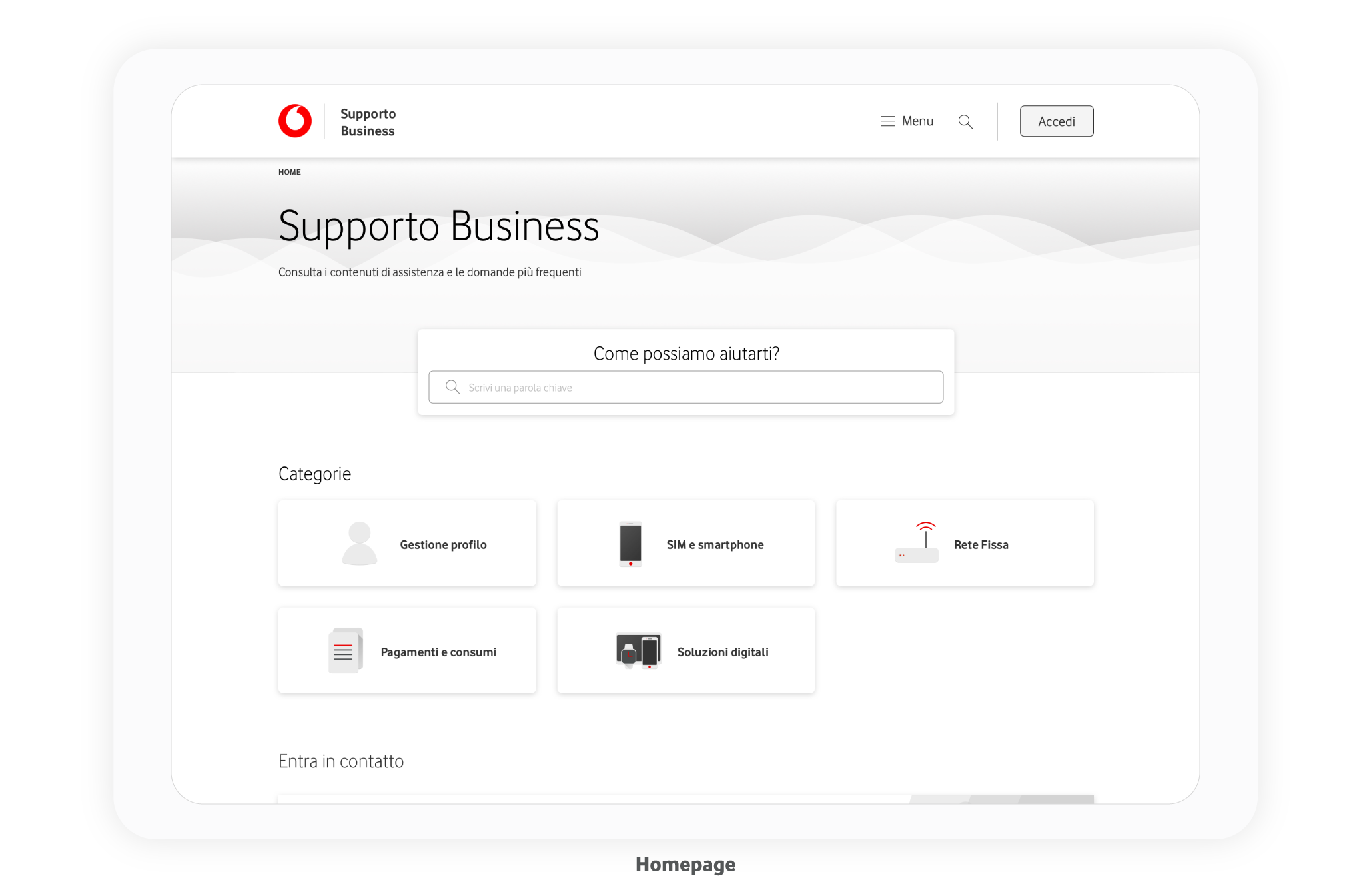
Entry point Support Home Page
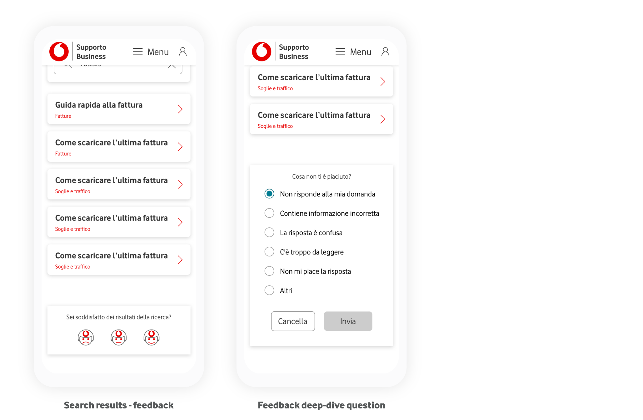
Search experience
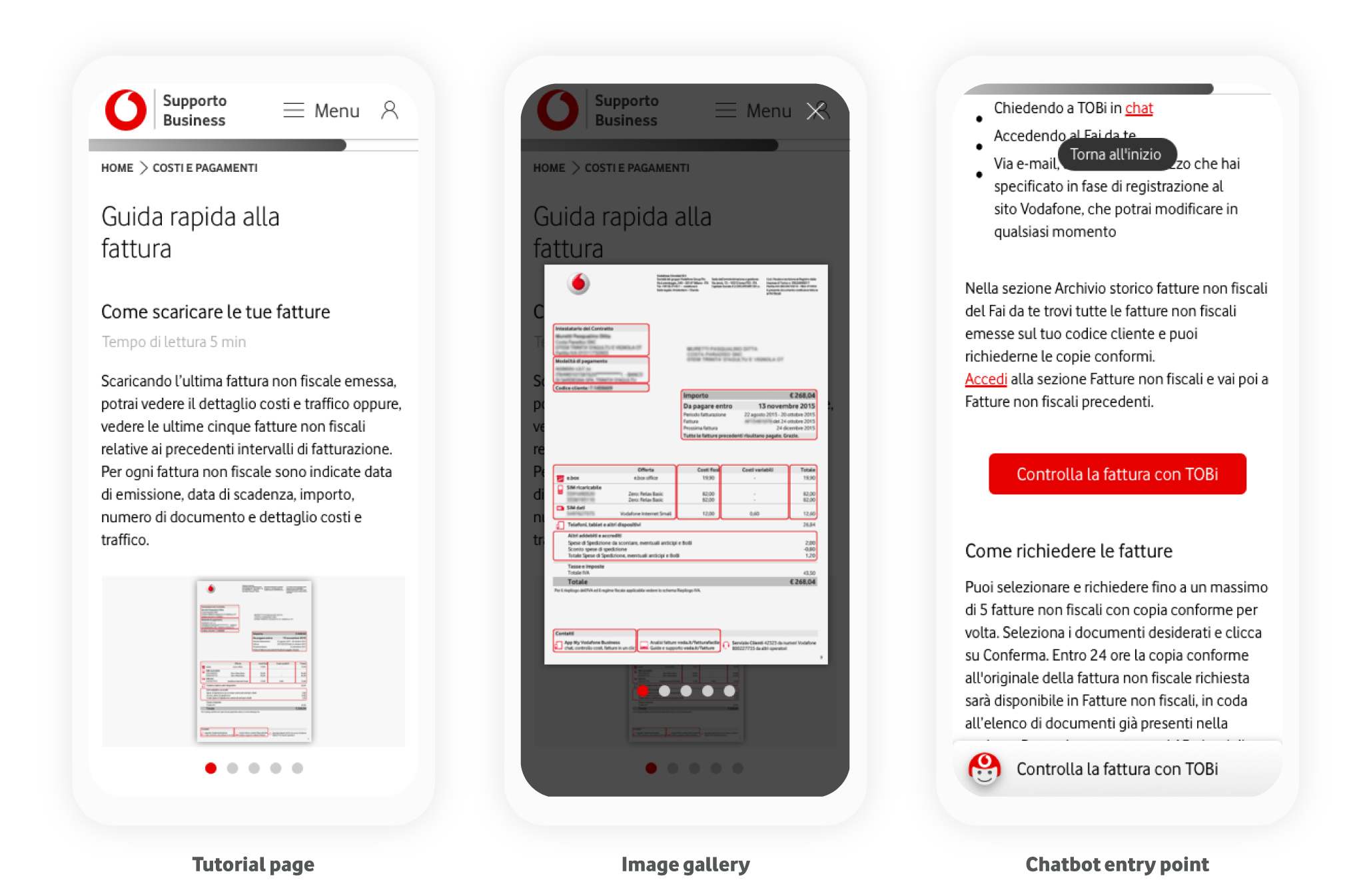
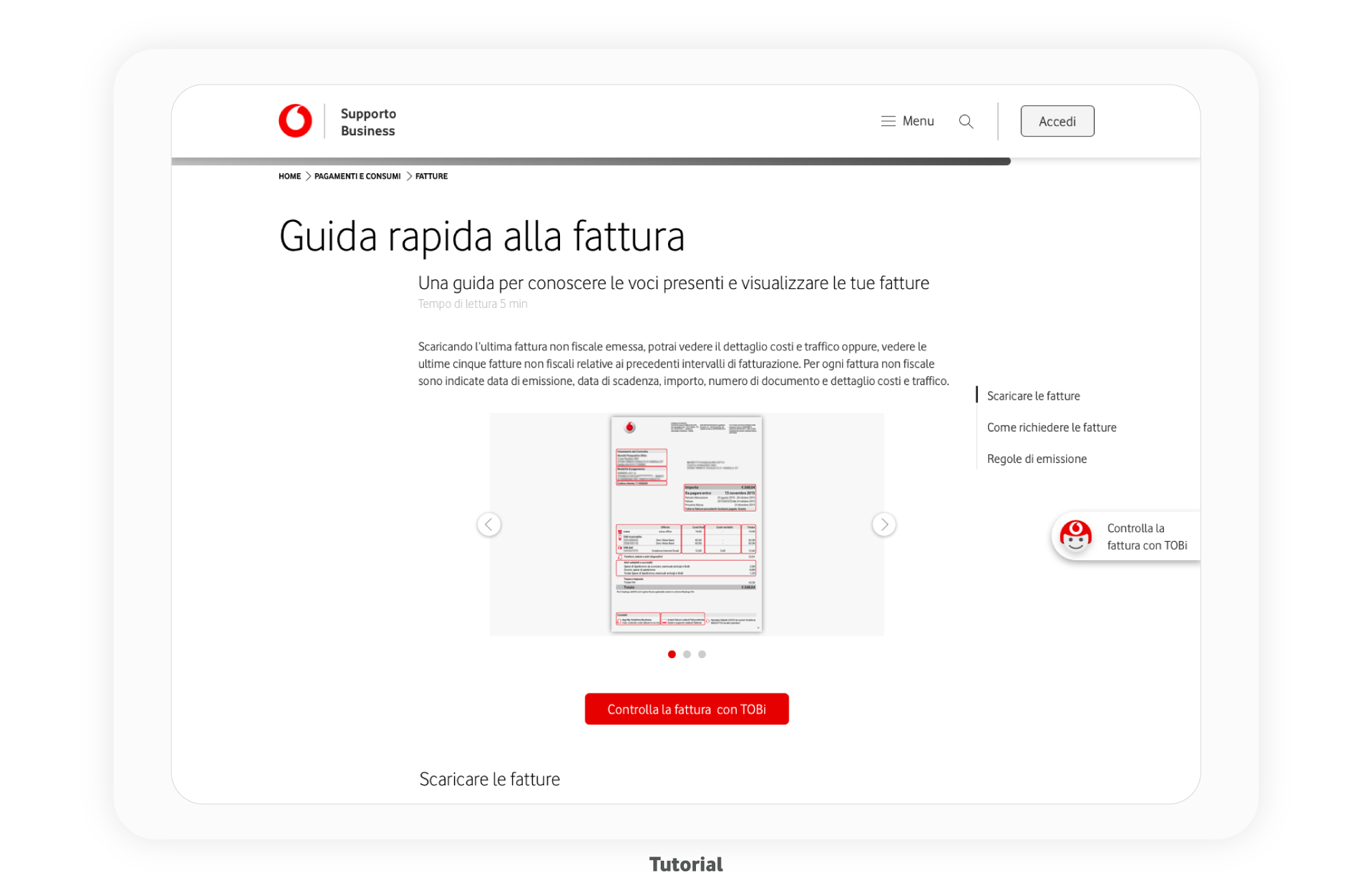
Tutorial page
Handover on the chatbot
Desktop experience
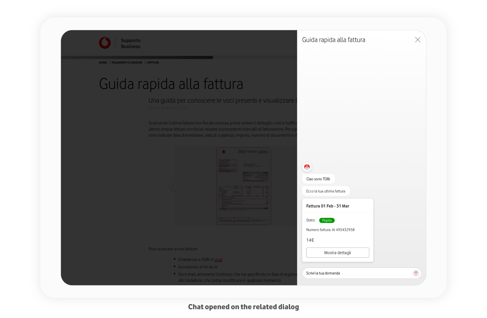
Development Specs
We provided detailed specs of each component to our IT Architects, Backend, and Frontend Developers.
We used InVision Inspect to share our style guides and Confluence to provide specs about the behaviors, including video mockups for transitions and animations.
Result
We presented the project to the Vodafone Business Directors and Product Owners and they were enthusiasts because it simplifies both user experiences for users and editors. They say it is a great innovation that helps Vodafone to go forward in its Digital transformation Process.
The project is still in development. It will be live soon.
During user tests, we increased CES +45% and Success rate by about +30%. We assume this will help to decrease rebound.
Tools
Miro, HotJar, Adobe Analytics, Invision Inspect, Confluence, Sketch, Principle, Zoom, Maze
Behind the scenes
We worked on this project during the Covid-19 pandemic. I would like to thank my amazing team, especially Christian and Stefano (photo) that support me the most to create the final mockup.
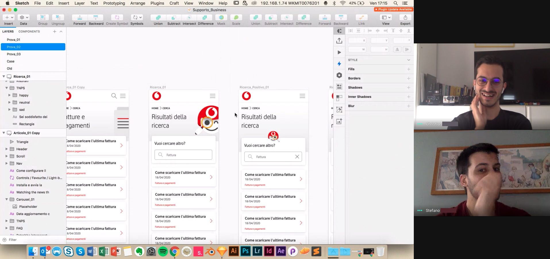
We enjoyed ourselves a lot, and we’ve found the right balance between hard work and funny moments.
Next project
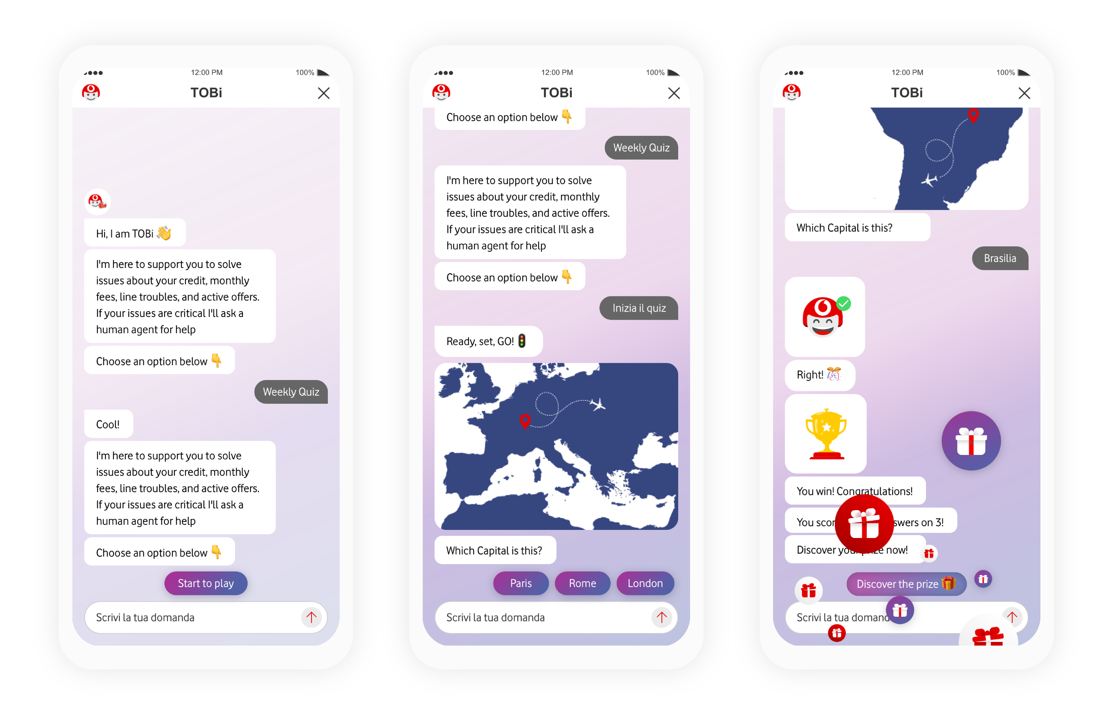
UX-UI Design
Chatbot celebrations
Do you like my portfolio?
Drop me an email at poli.simone09@gmail.com or hit me up on LinkedIn. I will be happy to talk about it together.